Motoinsight Branding
Year: 2018 - 2022
Role: Marketing & Web
As a lead designer and brand strategist, I was responsible for shaping and refining MotoInsight’s brand identity, ensuring a consistent and impactful visual presence across all touchpoints. The goal was to create a cohesive, scalable, and adaptable branding system that enhances brand recognition, credibility, and usability for internal teams and external partners.
Through comprehensive brand guidelines, marketing assets, and digital materials, this project aimed to unify MotoInsight’s brand language while allowing flexibility for diverse applications.
Design Approach
-
Designed a scalable visual identity system that aligns with MotoInsight’s positioning in the automotive retail industry.
Established brand guidelines covering typography, color palettes, iconography, and imagery to ensure consistency across all communications.
-
Created one-pagers, brochures, and sales presentations with a refined visual hierarchy to improve clarity and engagement.
Developed a library of branded templates to streamline content creation for internal teams and partners.
-
Designed digital assets for marketing campaigns, webinars, and social media, ensuring a cohesive online presence.
Optimized brand application on the website and landing pages, reinforcing brand consistency in digital experiences.
-
Structured a brand toolkit that allows marketing, sales, and design teams to efficiently apply branding across various platforms.
Ensured brand flexibility to accommodate client-specific marketing needs while maintaining visual integrity.

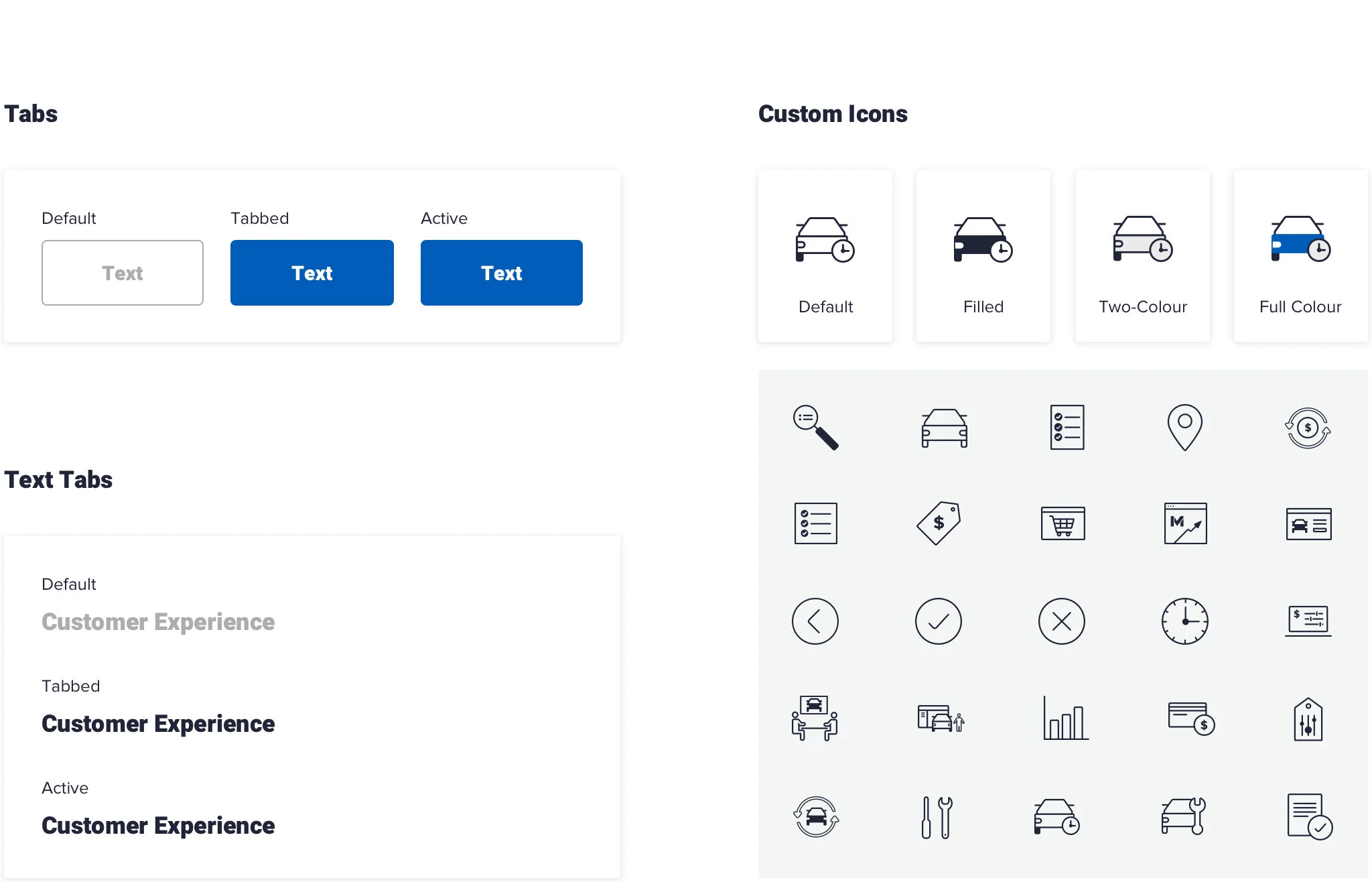
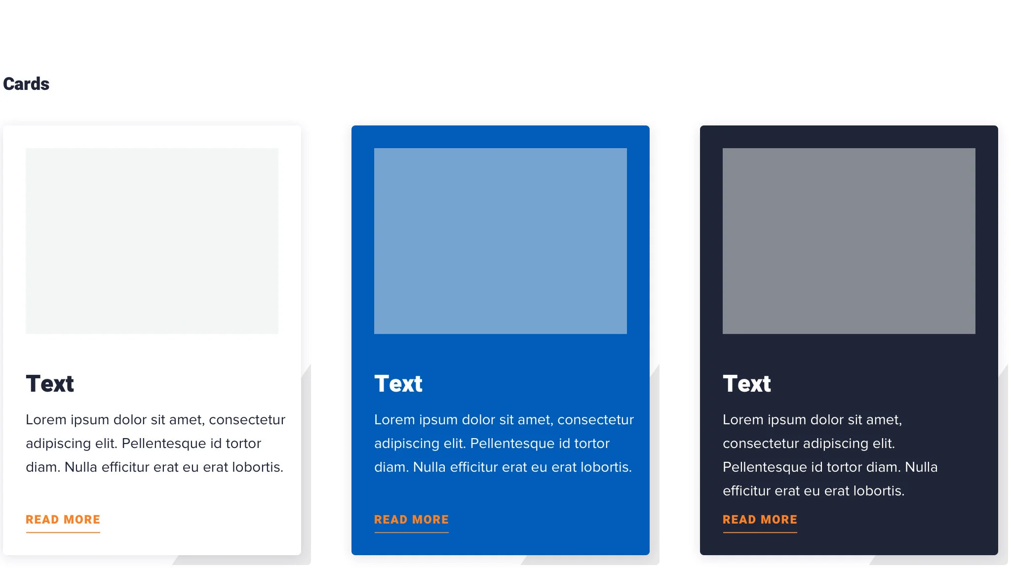
Brand Guideline
The brand guideline was enhanced with detailed explanations and examples, serving as a practical resource. It includes guidelines on logo usage, typography, color schemes, imagery, tone of voice, and application examples to ensure consistency across all touchpoints. Additionally, it covers brand positioning, product representation, people, and the style guide, providing a comprehensive framework for maintaining a cohesive and unified brand identity.


UI Kit
The existing website was visually functional but needed a redesign to better convey the company's objectives and clearly present its products. In collaboration with the marketing director and copywriter, the wireframe and content were reimagined. Following the brand guidelines, the website’s design and UI elements were developed simultaneously, establishing a cohesive foundation for future projects.


Corporate Website
The website’s structure, previously ineffective in delivering information, was improved by introducing an "Our Solution" section as the first item in the navigation bar. A bridging section was also added to the homepage, allowing users to quickly access relevant pages. To enhance trust, an image of the actual MotoCommerce product was prominently featured in the hero section, ensuring it is the first thing users see upon landing. Additionally, product images were strategically integrated with relevant content throughout the site, reinforcing credibility while enhancing design consistency and visual uniformity.


Presentation Design
A presentation template was designed to support both internal and external presentation needs. This default template enables presenters to easily customize and adapt it to their specific requirements while ensuring a consistent and professional appearance.


Room Name
As the company moved to a new location and the frequency of internal and external meetings increased, each meeting room was given a unique name. The naming concept was inspired by Motoinsight’s previous locations leading up to its current headquarters, as well as iconic racing tracks, symbolizing the company’s journey and identity.


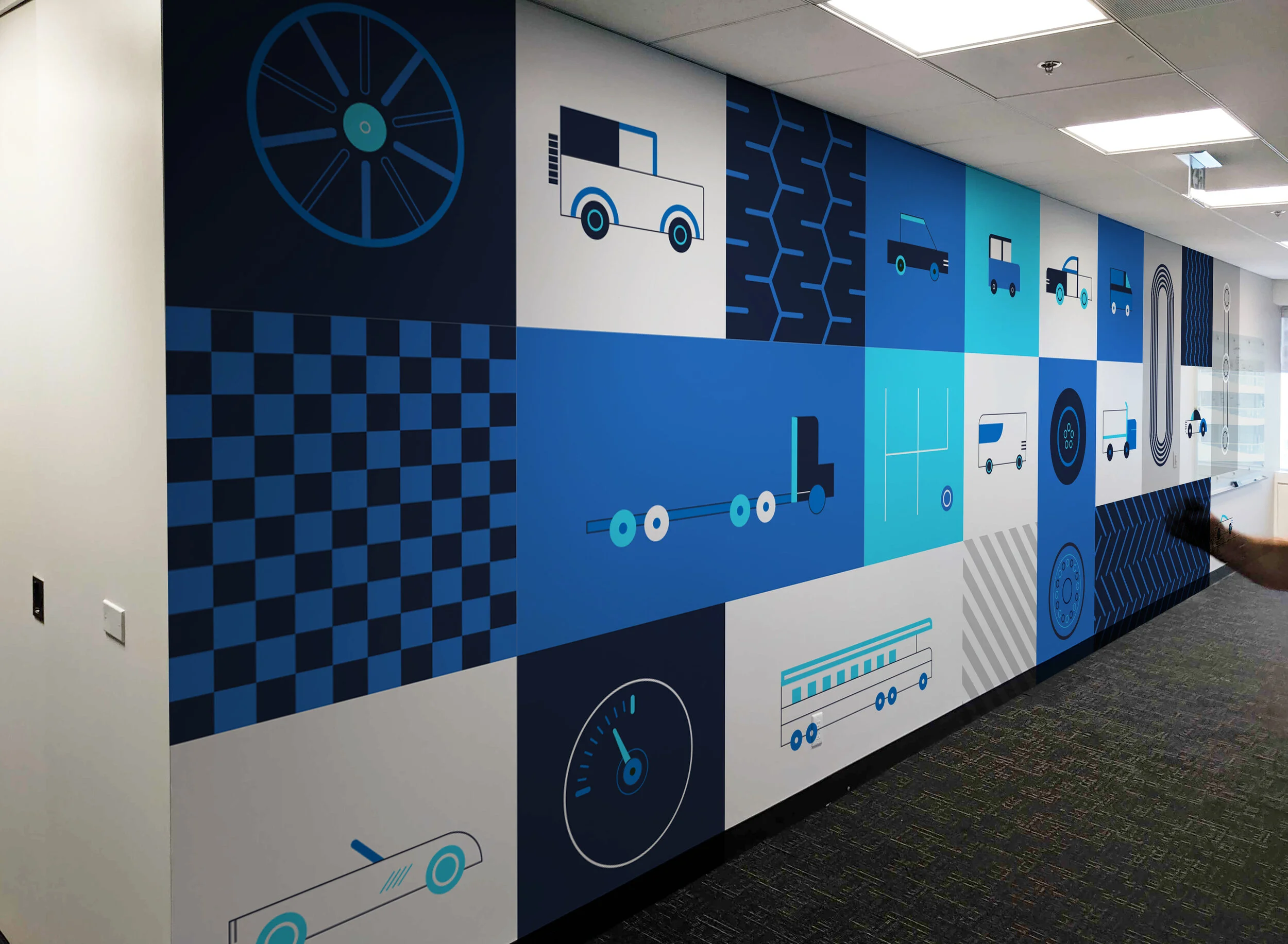
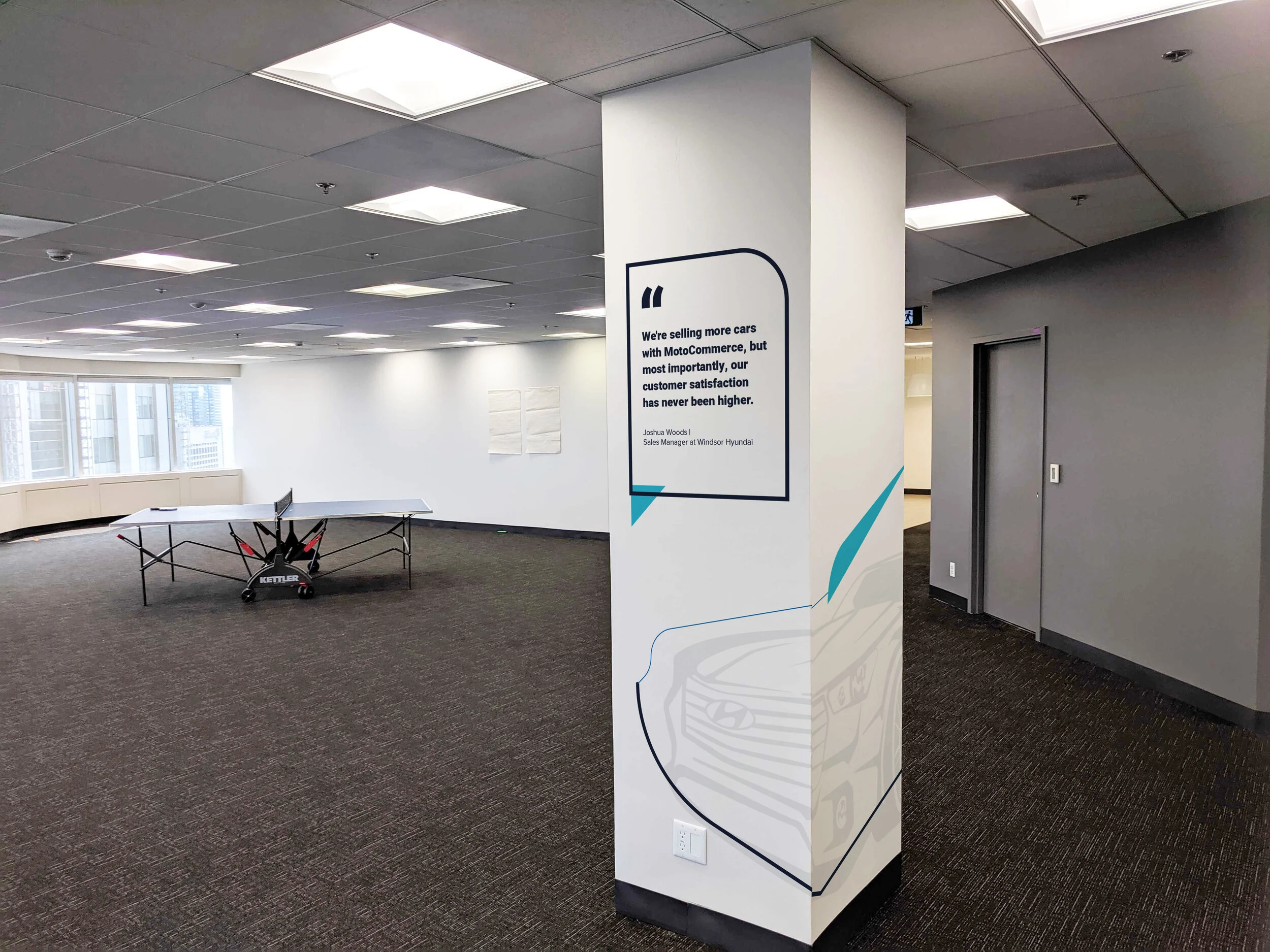
Mural Art
When Motoinsight moved to a new office, my role was to integrate the company’s brand throughout the entire office environment. The goal was to maintain a corporate and cohesive atmosphere in alignment with the brand guidelines, while incorporating illustrations to add a touch of creativity and make the space feel more welcoming and less rigid.


Holiday Card
At the end of each year, a holiday card is sent to Motocommerce clients as a gesture of gratitude and appreciation for their support.


Outcome & Impact
Stronger Brand Recognition – A unified design system reinforced MotoInsight’s identity across all channels, ensuring a cohesive and professional brand presence.
Improved Communication Efficiency – Standardized templates and comprehensive brand guidelines streamlined internal and external messaging, enabling faster and more consistent content creation.
Enhanced Marketing & Sales Support – Visually refined assets empowered sales teams to effectively communicate MotoInsight’s value proposition, improving clarity and engagement with potential clients.
Scalable & Future-Ready Brand System – A structured branding framework allowed for consistent, high-quality brand application, ensuring adaptability to evolving marketing needs and business growth.