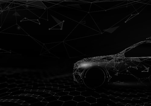
AutoSync Branding
Year: 2022 - 2023
Role: Branding
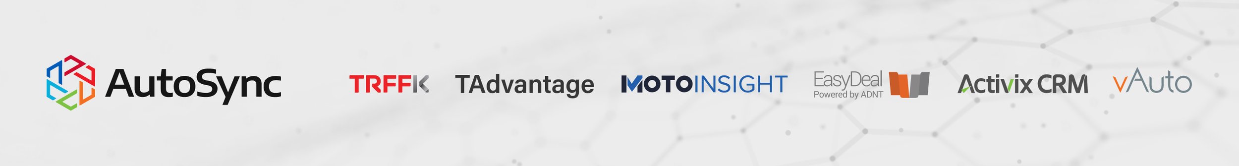
AutoSync, a division of Trader, serves as a centralized platform integrating multiple software solutions, including TRFFK, TAdvantage, Motoinsight, EasyDeal, Activix, and vAuto. These tools streamline every aspect of car purchasing, covering dealership management, inventory tracking, customer engagement, and traffic optimization.
To establish a strong and cohesive brand identity, AutoSync required a unified design system that could be seamlessly applied across marketing collateral, digital assets, and product communications. My role was to define and implement a scalable brand framework, ensuring consistency while maintaining flexibility for diverse use cases.
The primary challenge was harmonizing the distinct brand identities of each software unit into a cohesive, recognizable visual system. This involved designing a unified brand language across key touchpoints, including the landing page, presentation decks, social media ads, and other marketing materials. The goal was to position AutoSync as an integrated, innovative platform while preserving the unique value propositions of its individual components.
Design Approach
As the lead designer overseeing brand consistency, I developed a comprehensive visual identity system that serves as the foundation for AutoSync’s marketing and product design. The goal was to establish a cohesive yet adaptable framework that could be applied across various touchpoints while maintaining brand integrity.
-
I established a clear visual language by defining color palette, typography, and key design elements, ensuring a recognizable and unified brand presence across all assets. The hexagonal branding system was introduced as a signature unifying element, subtly reinforcing the connection between AutoSync’s products while allowing each unit to retain its unique identity.
-
A structured and adaptable brand framework was created, enabling seamless integration across marketing materials, digital assets, and product interfaces. This scalability ensured that the brand maintained consistency across all platforms, regardless of the medium or audience.
-
I designed core presentation materials, sales decks, and marketing collateral that aligned with AutoSync’s brand identity, delivering a polished and professional aesthetic for both internal and external communication. Each asset was developed to enhance storytelling, improve engagement, and streamline brand messaging.
-
To enhance efficiency and usability, I developed template-based assets that empowered teams to create content within predefined brand rules, ensuring that every output adhered to AutoSync’s visual standards while remaining flexible for various use cases. The system allowed for efficient content creation without sacrificing brand integrity or design quality.
Main Logo
The logo design consolidates six distinct units into a cohesive hexagonal form, representing harmony and unity while emphasizing the individuality of each unit through the use of distinct colors. Each company maintained its original logo, making the hexagonal emblem a central element of the overarching branding strategy.
The primary challenge in this branding initiative was to seamlessly integrate the hexagonal motif into each unit’s identity while accentuating their unique hexagonal components, reinforcing their affiliation with AutoSync.


Sub-brand Variations
Creating six distinct logos while maintaining a unified AutoSync brand identity posed a unique challenge. The goal was to establish a cohesive design system that allowed each product to retain its own identity while ensuring brand consistency across all AutoSync solutions.
The Solution: A Unified Visual System
A shared hexagon icon serves as the unifying brand element, positioned consistently across all logos.
Each product logo features a unique color within the hexagon, visually distinguishing them while keeping the core brand structure intact.
The remaining elements of the logo are kept monotone, reinforcing a modern, cohesive brand language across all sub-brands.
This approach successfully balanced individuality and unity, ensuring strong brand recognition while giving each product a distinct yet connected visual identity under the AutoSync umbrella.


Typography
The branding features the Overpass typeface, chosen for its modern and clean aesthetic. Its diagonal line endings on select letterforms complement the hexagonal imagery, creating a cohesive and visually harmonious design.

Colors
The color system was designed to balance brand cohesion and product differentiation. Each of the six product units is represented by a distinct accent color, while neutral tones are used for body text and supporting elements. This approach maintains visual harmony, ensuring that the brand feels structured and unified while preventing the vibrant product colors from overwhelming the overall design.

Business Card
The business card reflects AutoSync’s modern and cohesive branding while maintaining a clean and professional aesthetic. Designed for consistency, it seamlessly integrates the brand’s typography, color palette, and structural elements, ensuring it aligns with the overall identity system.
A key feature of the design is the inclusion of all six product logos on the back of the card, providing a quick visual representation of AutoSync’s ecosystem at a glance. This approach reinforces brand recognition while keeping the design sleek and minimal. The hexagon icon, a unifying element across all sub-brands, is subtly incorporated, using its distinct color variations to maintain clarity and differentiation.
The result is a business card that goes beyond a simple contact tool, serving as a strong brand statement that instantly communicates AutoSync’s presence and its suite of solutions.


Presentation Template
The presentation template was designed to establish a consistent and professional visual identity for AutoSync while ensuring flexibility for various use cases. It serves as the foundation for internal and external presentations, providing a structured layout that maintains clarity, readability, and brand cohesion.
The template follows AutoSync’s modern, data-driven aesthetic, incorporating a minimal and structured design. The hexagon icon and color-coded branding elements subtly reinforce the connection to AutoSync’s product suite. Typography, spacing, and layout were carefully considered to maintain a clean and organized look, ensuring that complex information is easy to digest.

To accommodate different types of presentations, the template includes a variety of slide layouts, from data-heavy analytics slides to visually engaging marketing pages. Each layout was designed with usability in mind, allowing presenters to seamlessly add content while maintaining a high level of visual consistency. The structured yet adaptable nature of the template makes it a scalable design solution that can be used across multiple teams and business functions.


Email Banner
The email banner was designed to visually reinforce AutoSync’s branding while ensuring high engagement and readability across different devices. Maintaining a clean and modern aesthetic, it aligns with the overall visual system used in other marketing materials, including the presentation deck, landing page, and social ads.
Key Design Features:
Consistent Branding – Uses AutoSync’s hexagon icon, brand colors, and typography for a cohesive look.
Clear Hierarchy – Structured layout with concise messaging and a strong CTA to drive conversions.
Engaging Visuals – Balances text and graphics to make information digestible while drawing attention to key details.


Holiday Card
Holiday and seasonal campaigns provide an opportunity to break away from AutoSync’s standard corporate design, allowing for a more engaging and festive approach. These moments serve as a chance to inject creativity and warmth into the brand while maintaining visual consistency with the overall identity.
For seasonal social media posts and marketing materials, I designed layouts that balanced playfulness and professionalism, ensuring they remained on-brand while standing out. These designs not only captured the spirit of the occasion but also provided an engaging way for AutoSync to connect with its audience on a more personal level.
By introducing unique design elements and creative executions, these holiday assets enhanced audience engagement and provided a refreshing variation from the brand’s typical communications.

Short Intro
I created an animated short intro for AutoSync, designed for Shorts and YouTube videos. The animation seamlessly aligns with AutoSync’s brand identity, ensuring a cohesive and professional visual presence across digital content.
Impact & Results
A Unified Brand Identity
A structured, well-defined design system ensured brand consistency across all marketing and communication channels, reinforcing AutoSync’s strong visual presence.
Improved Efficiency for Teams
Scalable templates and brand guidelines allowed internal teams to create on-brand materials independently, reducing the need for frequent design adjustments while maintaining visual integrity.
Professional & Polished Visuals
Every brand touchpoint—from presentations to digital marketing assets—was designed to be visually cohesive, polished, and strategically aligned, strengthening AutoSync’s credibility and industry presence.
This project showcases my expertise in developing and implementing scalable brand systems that balance creativity, consistency, and usability, enabling teams to effortlessly maintain a strong, recognizable brand.